

8 Tips for Choosing Pattern Combinations for Your Home Decor
- Jan 29, 2024
- 3 min read

Start with a color palette
That color palette might start with a fabric you fall in love with. Or an art print. Or a rug. Whatever it starts with, keep that theme going. In my living area, I have aqua blue, navy, and kelly green accents with white/aqua walls and colorful (navy and kelly green) furniture. I love the feeling that these lighter colors give the space, but I wanted to make sure it tied into the furniture as well.
Choose pattern combinations with different scales
Just like in quilting, when you combine fabrics, you want them to serve different purposes. They can’t all have a bold print or they’ll be competing. I love pulling in a solid color to keep things from competing, but you definitely don't have to. In this case, I chose a kelly green geometric print with a small scale that gives a nice overall color and still has lots of interest when you’re sitting next to it. Then I have a medium-to-large scale print in this feathers print that brings in a lot of contrast to the bold colors but still has a decent sized motif.

Do the “across the room” test
You might love the swatch, but what will it look like from across the room? When you’re in a store, step back an isle and look at your combination further back–it’s amazing what a little space or a different angle helps you see. Shopping online is a little more challenging–you just can’t do that with a little swatch. So look for different views to get a good idea of the scale. I adore this feature; I wish all online fabric stores had it. If you're not shopping online, pull the fabric out and set it somewhere then walk away a few feet to see how it looks from a distance.
Play with different print types
I like to mix a geometric with a “hero” pattern and one that’s a bit more natural or . In this combination, I went with the small geometric green print contrasted with the larger feathers. On the chairs, I added a buffalo check that contrasts with the floral pattern of the chair itself to play with a geometric and floral.

Know the feeling you want to evoke
Ask yourself, “What feeling do I get with this pattern combination?” It’s taken some time for me, but I know I want my home to feel fresh, so when I looked at my choices I made sure they felt fresh and alive together. I made a few tweaks initially until I found this combination, and it just felt like “home.”
Add some texture
Let’s talk about the actual fabric for a second. Mixing textures is a great way to add really subtle interest to your decor. If you look closely at these pillows, you can see the amazing texture of the linen–it’s so subtle, but it’s a nice dichotomy when put next to the velvet couch.
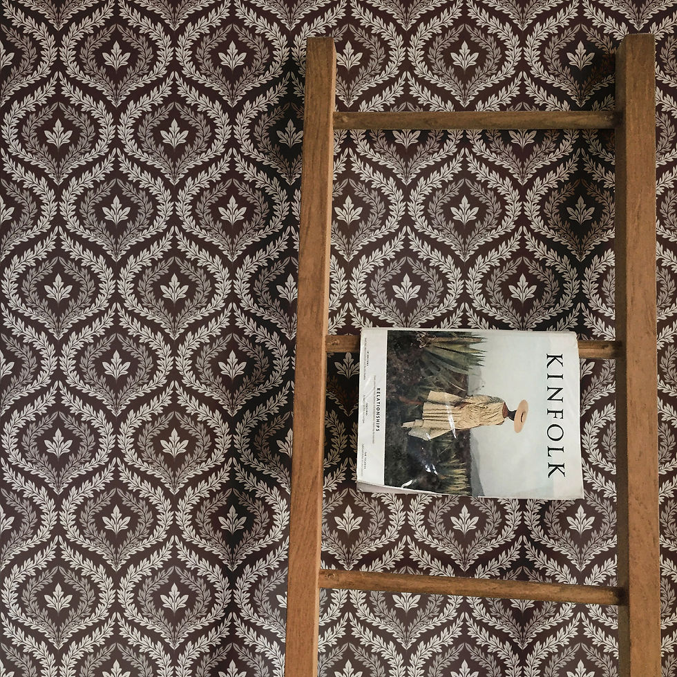
Keep the background and tones similar in your pattern combinations
You'll also want to make sure the background colors aren’t competing. You don’t want one with a white background and another with ivory or beige. It just won’t look cohesive. I chose patterns that all have white backgrounds, but you could also have a colored background as long as it’s intentional (so a same yellow or aqua background could have worked, but not ivory/white).
Make sure you love the pattern combinations
You have to live with it, so make sure you want to look at it all the time. If you do, you’re set! Choosing fabric combinations is a personal thing, and with a few tips to help you mix your style with design principles, you’ll be sure to find a winning combination.

What tips do you have to add for choosing pattern combinations? What works for you? I’d love to hear your ideas in the comments!


Comments